Get inspired from these time-tested color comninations for your own wedding.
The wedding color palette you settle on will help drive the visual components of your day and ensure everything looks on-theme and cohesive. It is the anchor for your big-day décor.
So, selecting your wedding colors should be one of the first décor-related decisions you make. It is inspired by your personal preferences and your event's seasonality and location.
Keep basic design rules in mind when curating a tasteful palette.
Not all shade combinations work well together, here's a solid rule of thumb:
Choose one or two colors as main hues, then one or two secondary colors in neutral options, which will help blend those focal point colors seamlessly. Then consider a fun accent shade—such as a metallic like gold or silver to finish the overall vibe—that you'll use sparingly throughout your event.
Here is a comprehensive collection of color palettes that real couples integrated into their celebrations. Looking to these examples when you plan your own wedding color scheme to inspire your design decisions.
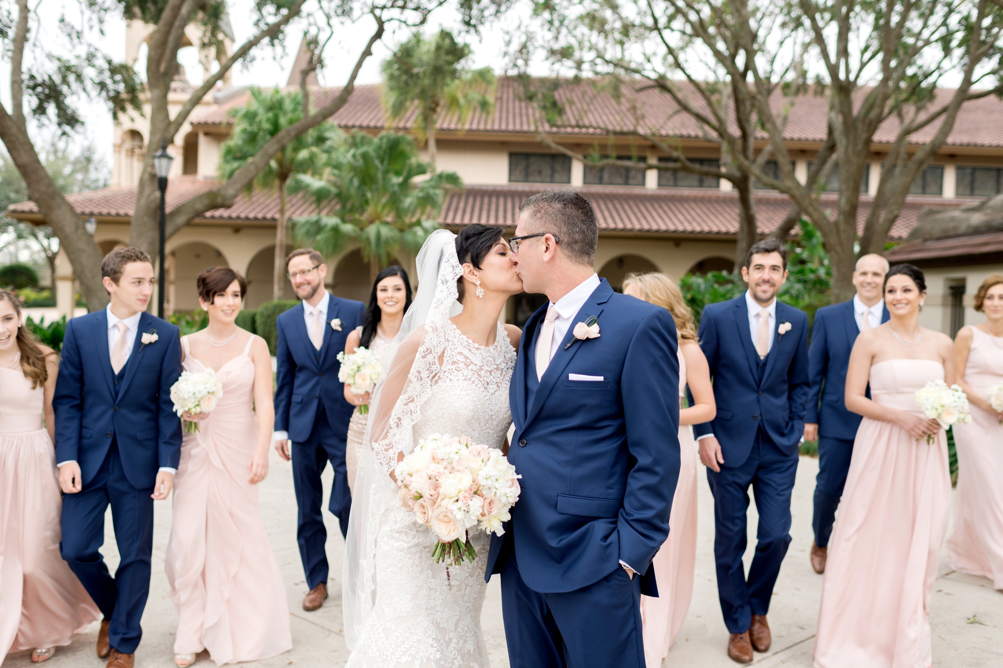
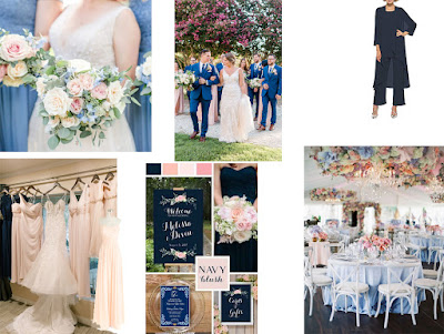
Pastels are pretty. A wedding palette full of pretty pastels like blush, blue, and cream is romantic and soft.
Order: Blush Pink Bridesmaid Dress / Navy Blue Wedding Invitation / Navy Mother of the Bride Pantsuit
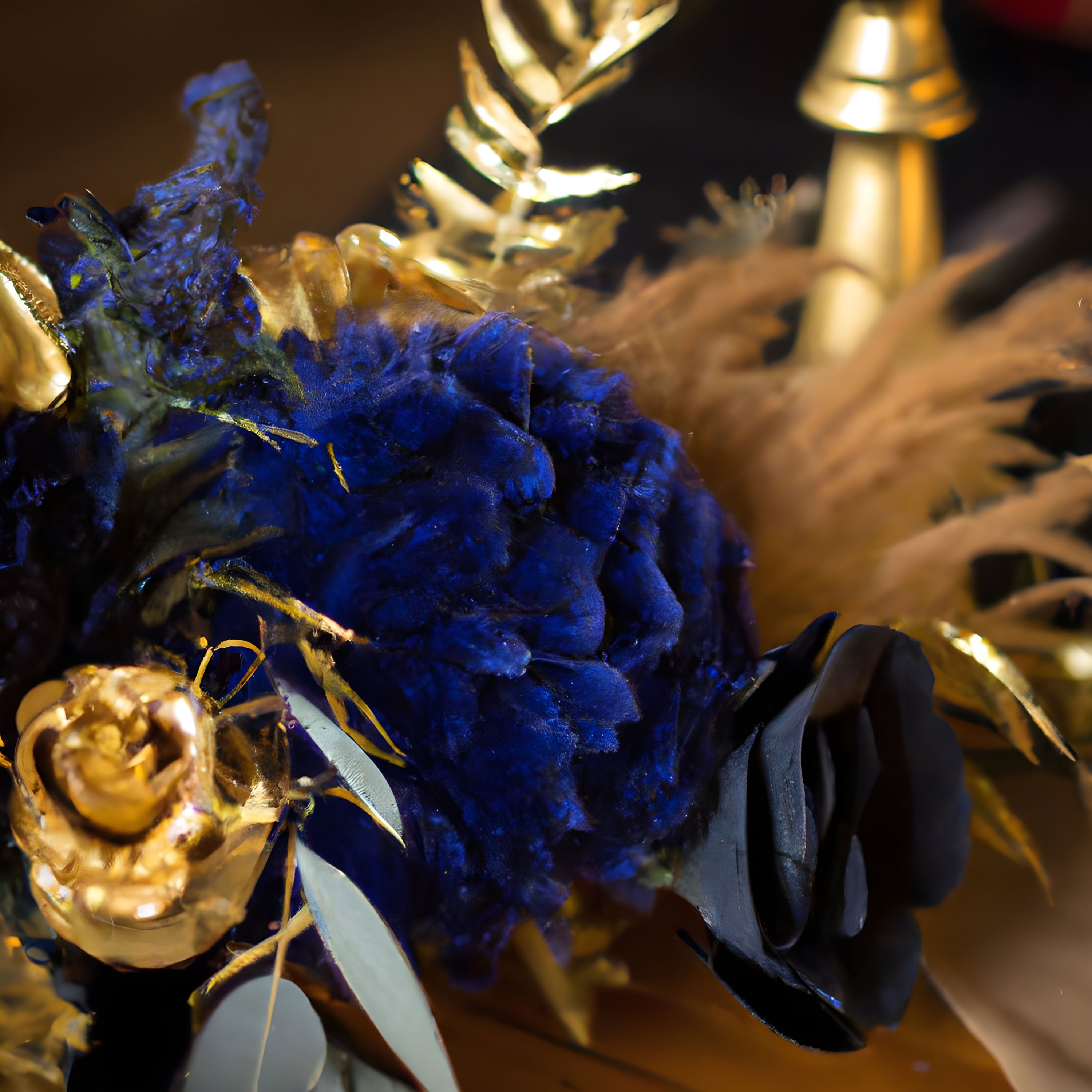
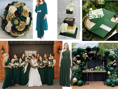
Black, Gold, Hunter Green is city-chic and elegant. This color grouping is perfect for an upscale city wedding.
Green Bridesmaid Dresses / Turquoise Mother of the Bride Pantsuit / Green Pocket Wedding Invitations
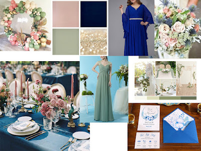
Sage green, french blue, pale pink, cream and gold, a lovely, romantic and classic color palette. The combination is perfect for couples who love pastels and want to add contrast bolder colors as statement.
Sage green bridesmaid dress / Royal blue mother of the bride dress / French blue pocket wedding invite
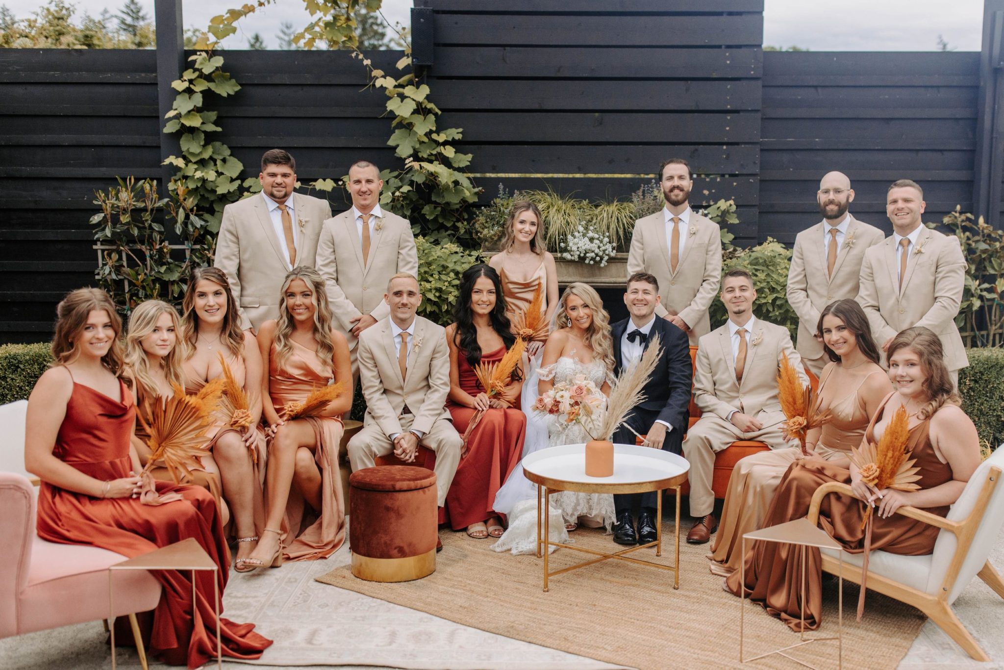
Mauve, Navy, and Maroon, perfect for a late summer or fall celebration. Together with tan and cream adds warmth to any wedding celebration.
Navy blue bridesmaid dress / mauve mother of the bride dress / maroon acrylic wedding invitation
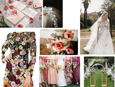
Floral varying tones and textures, with a palette of purple, peach, green, and pink will make a spring wedding party lovely.
Bohemian and Earthy Tones: blush, sage, sea and chocolate. These colors are inspired from natural surroundings. They aren't all neutrals, they feel bohemian and earthy in a unique way.
Vibrant raspberry,soft gray and light blush. Opting for vibrant color raspberry as the anchor for your color palette, and have a few subtle hues— soft gray, light blush—to help balance the look.
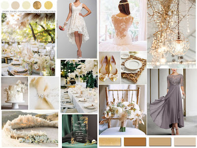
Touch of Gold with cream, blush or taupe could just as easily fit into a summer estate wedding as it could into a regal winter ballroom affair.
